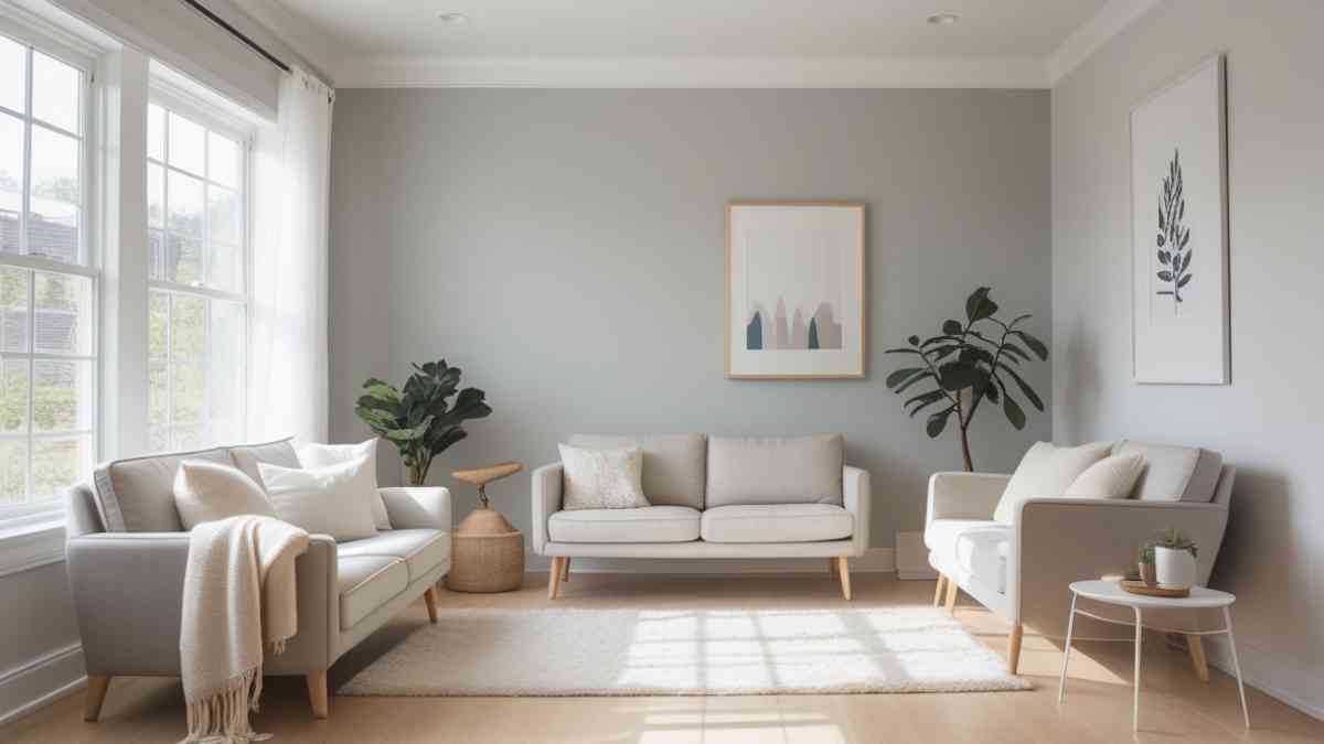
Drift of Mist Sherwin Williams is a light, warm gray paint color with soft greige undertones, making it an ideal choice for creating calm, inviting interiors. With a high Light Reflectance Value (LRV) of 69, it brightens spaces while maintaining a subtle, sophisticated look. Its versatility allows it to pair beautifully with a range of styles—from modern to farmhouse—and coordinates seamlessly with both cool and warm tones. Perfect for living rooms, bedrooms, kitchens, and bathrooms, Drift of Mist offers a timeless backdrop that enhances natural light and complements any décor.
What Is Drift of Mist by Sherwin Williams?
Drift of Mist (SW 9166) by Sherwin Williams is a subtle, warm gray paint color often described as a greige—meaning a blend of gray and beige. With a light reflectance value (LRV) of 69, it sits comfortably on the lighter side of the spectrum, making it a highly versatile choice for interiors. It’s soft, elegant, and adaptable, and that’s exactly why it’s rapidly gaining popularity in modern homes.
Whether you’re aiming for a minimalist look or a cozy, layered aesthetic, Drift of Mist acts as a perfect backdrop. It offers just enough color to define a space without overwhelming it. As the name suggests, it brings a foggy, gentle atmosphere to any room.
The Psychology Behind Drift of Mist
Colors in our environment have a profound psychological impact. Drift of Mist’s muted tone evokes feelings of calm, serenity, and clarity. The color leans warm, which contributes to a sense of comfort and approachability. It’s no surprise that designers often use this hue in living rooms, bedrooms, and offices where a peaceful ambiance is key.
Its green and taupe undertones can occasionally shift slightly depending on natural or artificial lighting, but they never become too sharp or vibrant. This gentle mutability is what makes Drift of Mist so livable and welcoming.
Light Reflectance Value and Room Impact
The LRV of 69 means Drift of Mist reflects a good amount of light, brightening spaces without appearing stark white. In north-facing rooms, it may lean a bit cooler and grayer. In south-facing or well-lit rooms, it glows with a soft warmth that enhances natural light beautifully.
For small rooms or those without much daylight, Drift of Mist can make the space feel more open and airy. In large rooms, it helps create cohesion and calm across expansive walls without becoming monotonous.
Best Rooms to Use Drift of Mist
Living Rooms Drift of Mist is an ideal choice for living rooms because it blends well with various décor styles. Whether you prefer contemporary furniture, farmhouse charm, or Scandinavian simplicity, this neutral supports your aesthetic without competing with bolder elements.
Bedrooms In bedrooms, this color promotes a restful, serene atmosphere. Paired with soft linens, wood tones, or muted pastels, Drift of Mist helps craft a retreat-like space that feels both stylish and grounded.
Kitchens and Dining Areas For kitchens and dining rooms, it offers a clean backdrop that harmonizes with cabinets, tile, or stone. It works particularly well with natural wood, brushed metals, and light countertops.
Bathrooms Its light and airy character makes bathrooms feel spa-like. When used with white trim and marble or quartz finishes, it creates a refined and luxurious experience.
Hallways and Entryways These transitional areas benefit from a color that can flow well into adjoining rooms. Drift of Mist is soft enough to suit every connecting space while still offering definition.
Color Pairings and Coordinating Shades
Drift of Mist’s chameleon-like quality means it works with a wide array of complementary shades.
Trim Colors
- Pure White (SW 7005): A warm white that adds softness.
- High Reflective White (SW 7757): A bright, clean contrast.
- Alabaster (SW 7008): Another warm white that enhances Drift of Mist’s warmth.
Accent Colors
- Sea Salt (SW 6204): A calm, coastal green that brings freshness.
- Mindful Gray (SW 7016): A medium gray that adds depth.
- Gossamer Veil (SW 9165): A neighboring neutral that layers beautifully.
- Pewter Green (SW 6208): For bold cabinetry or feature walls.
Wood Tones and Materials
- Light oak, maple, or walnut all pair well with this shade.
- Brushed nickel or matte black hardware offers a modern touch.
- Natural stone like travertine, marble, or quartz enhances the elegance.
How Lighting Affects Drift of Mist
Lighting can dramatically influence how Drift of Mist appears:
- In north-facing rooms, the paint can appear slightly cooler and more muted.
- In south-facing or sun-drenched rooms, it becomes warmer and more greige.
- Under LED or incandescent lighting, it maintains warmth and balance.
It’s wise to test the color on your walls at different times of day to observe how it responds to changing light conditions. Paint sample swatches on multiple walls to get the most accurate idea.
Paint Finish Recommendations
The right finish can elevate Drift of Mist:
- Matte or flat finish: Best for low-traffic areas like bedrooms or ceilings.
- Eggshell or satin: Ideal for living rooms, hallways, or kitchens for easy cleaning with a soft sheen.
- Semi-gloss: Works well on trims, doors, or cabinets to add contrast and durability.
Each finish brings out a different nuance of the color, so choosing wisely enhances both function and aesthetics.
Design Styles That Suit Drift of Mist
Modern Minimalist: Its muted tone supports a clutter-free, clean look. Transitional: A perfect bridge between traditional charm and contemporary lines. Scandinavian: Enhances airy, light-filled interiors with natural materials. Farmhouse: Complements rustic wood, neutral textiles, and vintage accents. Coastal: Works seamlessly with breezy blues, sandy hues, and organic textures.
Drift of Mist proves that simplicity doesn’t have to be boring. It’s subtle, yes, but also full of quiet depth.
How to Sample and Test the Color
Before committing to any paint, it’s crucial to test it out:
- Use peel-and-stick samples or paint a large poster board.
- View the sample in various lighting and at different times of day.
- Compare it to your trim, flooring, and furniture.
These steps help ensure that Drift of Mist harmonizes with your unique space.
Real-Life Inspiration
Many homeowners have embraced Drift of Mist in:
- Open-concept living areas: As a unifying backdrop.
- Kitchen cabinets: For a light, non-white option.
- Bathroom vanities: Offering a soft, sophisticated look.
- Ceilings: For a warm alternative to stark white.
Its ability to work with natural textures like jute rugs, rattan furniture, or linen drapes makes it a designer favorite.
Conclusion
Drift of Mist by Sherwin Williams is more than just a paint color—it’s a foundation for serene, sophisticated design. Its balance of warmth, lightness, and neutrality allows it to adapt effortlessly to different spaces and styles. Whether you’re refreshing one room or painting an entire home, this shade delivers timeless elegance.
Its enduring appeal lies in how it makes a space feel: peaceful, inviting, and polished. That’s why Drift of Mist Sherwin Williams continues to be a top contender for those who want style that lasts.
Elevate your space with the timeless charm of Drift of Mist.